Case study
A Grand Prix page with no images
The Silverstone '26 concept sells a race weekend without a single photograph. Every visual on it is drawn by the browser. Here's why I set that rule, and what it bought.
Count the photographs on a Formula 1 ticket page. There are usually dozens: cars, crowds, a driver holding a trophy. Each one arrives slowly, on a phone, in a field, on one bar of signal.
The Silverstone '26 concept has none. Not one image file. The track map is drawn, the light streaks are painted by the browser, and even the film grain is a few lines of code. The whole page is type, colour and geometry.
That was the rule I set before I started. This is what happened when I kept it.
The brief I wrote myself
Make a page about speed feel fast
Formula 1 is the fastest thing most of us will ever watch, and the websites around it are slow. Big hero videos, photo carousels, a queue of tracking scripts. On race weekend, standing on the banking at Becketts, they crawl.
So my brief had one line in it: sell the British Grand Prix in a way that feels like the sport. Quick to arrive. Loud to look at. Precise about every number.
Then I added the constraint that shaped everything else. No images. If the page is about speed, it should be fast in a way you can feel, and nothing slows a page down like photography.
The constraint I added
No raster images, not even one
The rule went further than "no stock photography". Nothing on the page was allowed to be a photograph, a screenshot, or an exported bitmap of any kind, not the light streaks, not the film grain, not even the social preview card. If it looked like a picture, it had to be drawn by the browser in code, or it didn't go on the page.
That wasn't purism. It was easy to break under deadline pressure, which is exactly why I made it absolute instead of a guideline I could talk myself out of on a Friday. A Grand Prix ticket page has one job: convince someone in a hurry, probably on mobile data, standing in a field with one bar of signal. A rule with an exception isn't a rule.
The decisions
Five calls, and why
Draw the circuit instead of photographing it
The obvious hero is a photo of cars piling into Copse. It would also be the heaviest thing on the page, and it would tell you nothing you didn't already know.
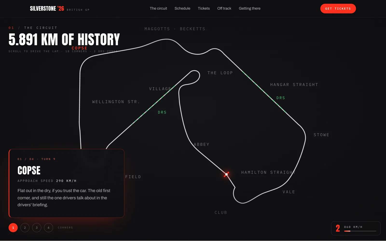
So the hero is the circuit itself: the real shape of the lap, all eighteen corners labelled, drawn as a single graphic that weighs less than a thumbnail. A photograph shows you what Silverstone looks like. The map shows you what it is.
Open with a wait
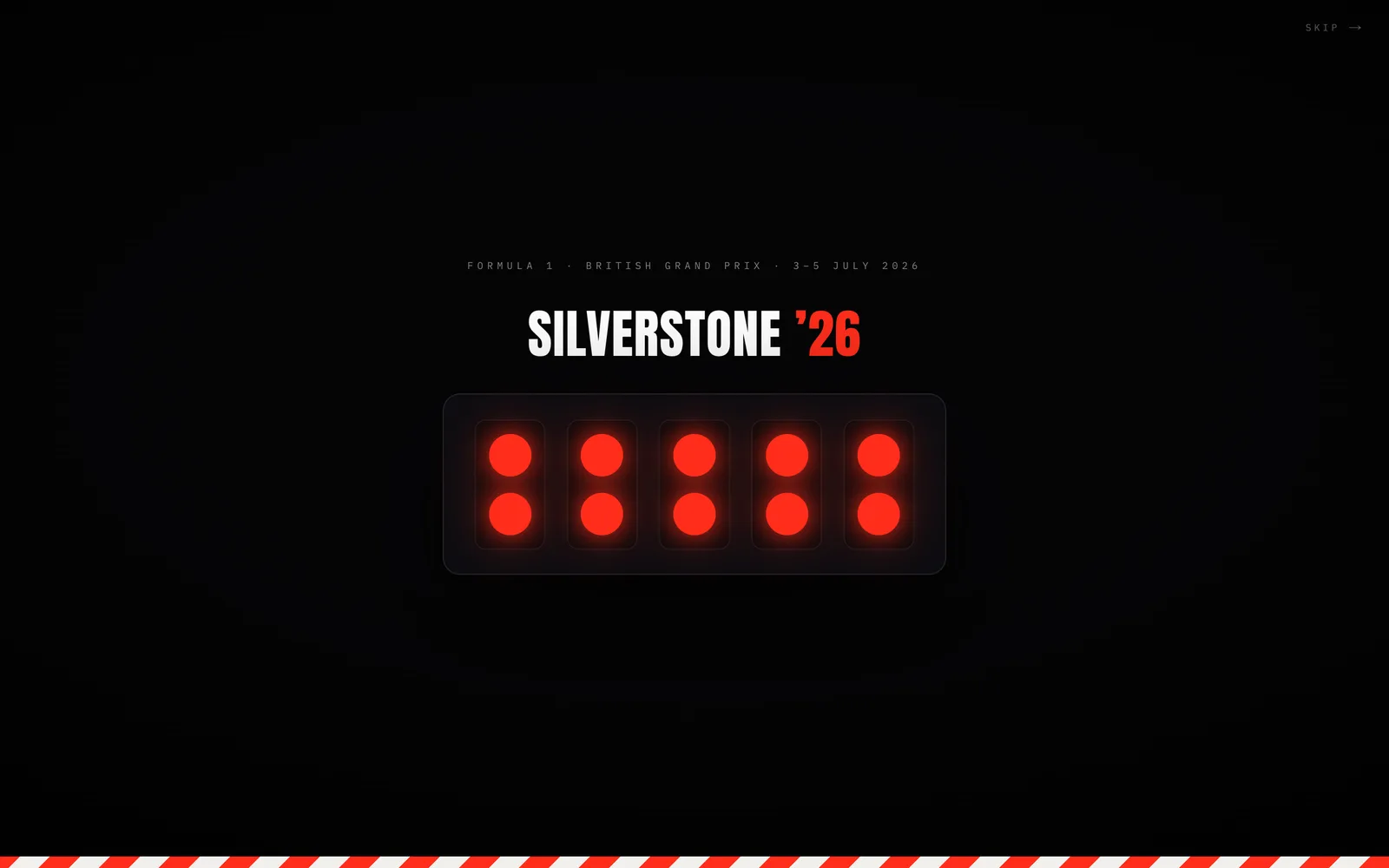
There is exactly one slow moment on the page, and it's deliberate. Before anything else, five red lights come on, one at a time. Then they go out, and the page starts. Anyone who has watched a race start knows that feeling in their chest.
A wait you can't refuse is a toll, not a thrill. So there's a skip in the corner, and if your phone is set to reduce motion you go straight in. The trick has an exit, which is the only way a trick like this earns its place.
Set every number in a timing font
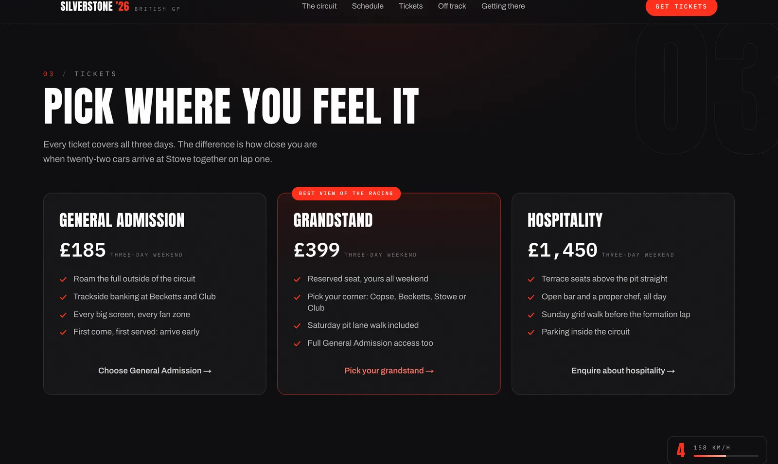
The lap record, the ticket prices, the countdown, the session times: every figure on the page sits in the same monospaced type, digits aligned in columns like a timing screen.
This page asks people for £185 to £1,450. Numbers that line up read as measured. Numbers in a display font read as marketing. When you want someone to trust a price, typography is doing more of the work than you'd think.
Let scroll do the driving
The circuit section pins to your screen, and scrolling moves the car round the lap. At Copse, Maggotts and Becketts, Stowe and Club, the page stops you and tells you what makes that corner worth sitting at, with the approach speed alongside.
Numbered dots let you jump straight to a corner, because scrubbing back through four screens of track to reread one note is tedious. And on an older browser the theatre quietly switches off while every word stays. Nobody gets locked out of the content by the trick built on top of it.
Sell like a ticket page, not a poster
Under the noise, the bones are a working ticket page. Three tiers with honest perks and one clearly marked best buy. A schedule planned to the minute with the race day open by default. An FAQ that answers what people ask before they ask it: what if it rains, can I bring the kids, can I leave and come back.
The boring parts are the job. A concept that skips them is a poster, and posters don't convert anyone.
What didn't work first
The honest version: the two showpiece tricks both needed escape hatches before they deserved to ship. The start-lights gate got its skip button because a forced wait stops being fun on the second visit. The scroll-driven lap got its jump dots because without them, finding one corner again meant scrubbing the whole circuit.
If an idea needs an escape hatch, that isn't the idea failing. Shipping it without one would be.
The proof
- 0
- Image files on the page
- 18
- Corners drawn and labelled
- 388 KB
- The whole page, start to finish
- 1:27.097
- The lap record, to the millisecond
Every visual is code
One vector graphic
34 requests, not one of them a photo
Set in the timing font
Check it yourself: open the live page, open your browser's Network tab, and reload. The entire thing arrives in under 400KB. A single hero photo on most sites is heavier than that.
What this means for your business
Your customers are not on your office wifi. They're on a phone, outside, holding a coffee. Photography is usually the heaviest thing on a small business website, and the reason so many salon and café sites take eight seconds to show anything.
You don't need to ban photos. You need someone who treats speed as a design decision rather than an accident, who compresses the images, cuts the scripts, and asks whether each thing earns its weight. Bookings follow attention, and nobody books from a page they gave up on waiting for.
If your site feels slow, that's fixable. Usually for less than you think.
Closest service: Get in touch