Case study
The only brand in sport that whispers
Every tennis site shouts: sponsor boards, autoplay highlights, a countdown flashing red. The Wimbledon '26 concept holds its breath instead. Here's the day it follows, and what stayed quiet on purpose.
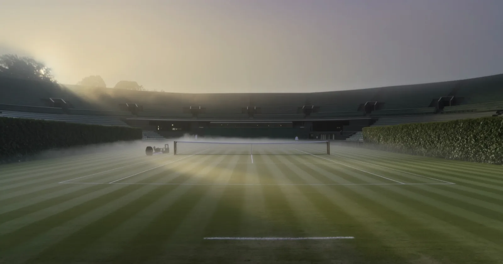
Five in the morning at the All England Club, and the grounds are empty. Dew on the grass, mist still sitting in the stands, nobody there but the groundskeepers. By four that afternoon it will hold fifteen thousand people watching two men decide a Championship. Nothing about the place will look sponsored in between.
That gap, quiet grounds to a full Centre Court, is the whole idea. Wimbledon is the one event in sport that doesn't need to shout to be the biggest thing happening. I wanted a page that behaved the same way.
The brief I wrote myself
Design a page that whispers louder than a shout
Most sports pages fight for attention because most sports need to. Wimbledon doesn't. It has one colour, one shape of grass, and a hundred and fifty years of not needing to explain itself. The design brief was to earn that same confidence in a browser tab.
So the page follows the actual shape of finals day rather than a template: dawn, gates, order of play, one point played out shot by shot, the numbers, and then the final itself. If the story has a beginning and an end already, you don't need a hero banner shouting to get started.
The constraint I added
Nothing moves until you scroll it
Before I built anything I set one rule: no autoplay. Nothing on the page fires on load, nothing animates on a timer, nothing ticks down while you're still reading the first line. If it moves, you have to be the one moving it.
That's a harder rule than it sounds. The serve sequence, the Pimm's glass filling, the crossfade from empty court to full crowd: all of it had to run off scroll position instead of a clock. A timer decides your pace for you, and deciding someone's pace for them is its own kind of shouting. Wimbledon doesn't rush anyone through the gates, and I didn't want the page to either.
The decisions
Five calls, in the order the day happens
Open on nobody
The first thing you see is an empty court at dawn: mist, dew, tiered stands with no one in them. Then, on a single crossfade, the same exact camera position fills with a finals-day crowd. Same framing, no cut.
A stadium full of people is the obvious opening shot. An empty one is the more honest promise: this is what the day costs to fill. The crossfade only works because both frames share one camera position. Different angles would have read as two separate photos, not one place changing.
Play one point in slow motion
Partway down the page, one championship point is played out shot by shot: the toss, the coil, the strike, the landing. You scroll and the serve advances, frame by frame, instead of autoplaying past you.
A highlights reel asks you to watch. This asks you to move it yourself, at your own pace, which is closer to what actually happens when a good point holds a crowd silent: everyone leans in at their own speed, together.
Let the numbers set themselves in scoreboard type
Every count on the page, the fastest serve ever recorded here, the tonnes of strawberries, the glasses of Pimm's, counts up in Space Mono, the same family a scoreboard would use. The headlines sit in Cormorant Garamond, an old-club serif with a raised-eyebrow italic for the lines that need one.
Two typefaces doing two jobs: one for the numbers you're meant to trust, one for the sentences you're meant to feel. Mixing them in the wrong places is how a page ends up sounding like a spreadsheet or a greetings card. Kept apart, each does its job properly.
Fill the Pimm's glass as you scroll
By the strawberries-and-Pimm's section, a glass on the page fills stage by stage, ice, pour, fruit, mint, condensation, timed to your scroll position rather than a fixed animation.
It's a small trick, and it's there because the alternative, a finished glass sitting still, says nothing that a photograph couldn't. Building it in front of you gives the moment the one thing photography can't: time passing at your pace.
Give the final a scoreboard, not a poster
The finals card itself reads like something pinned up in a locker room: seeding, height, sets dropped, aces, break points saved, head to head, each line marked for who holds the edge. Then one honest prediction paragraph that hedges exactly as much as a real one would.
A poster tells you the match is happening. A scoreboard lets you argue with it, which is the more interesting way to spend the ten minutes before a final.
The loudest thing here is the grass.
What didn't work first
The gate crossfade went through two attempts before it worked. The first empty-court and full-crowd images were generated separately and the camera didn't quite match: close enough to notice, not close enough to feel intentional. A near-identical crossfade reads worse than an obvious cut, because it looks like a mistake instead of a choice.
The fix was generating the crowded version directly from the empty one, same file, same camera, with an instruction to change only the moment, not the framing. Small difference in process, and the only version of the trick that actually lands.
The proof
- 153
- mph, the fastest serve ever recorded here
- 665
- minutes, the longest match ever played
- 28
- tonnes of strawberries across the fortnight
- 0
- Sponsor logos, pop-ups or autoplay sound
2010
The quiet is the whole brief
The tennis numbers are real Wimbledon history. The last one is about the page: no sponsor boards, no pop-up asking for your email, no video that starts shouting before you've read a word. Open it and see for yourself.
What this means for your business
Not every business needs a page that whispers. But every business gets to choose its own volume, and most website builders only offer one setting: loud. Banners, pop-ups, an autoplay video that starts before you've read a word.
A salon or a wellness practice earns trust the same way Wimbledon does: by being confident enough not to shout. The calmest sites I build tend to be the ones that convert best, because a page that isn't fighting for attention is easier to trust.
If your current site feels like it's yelling to be noticed, that's a design choice, and it can be a different one.
Closest service: Website design